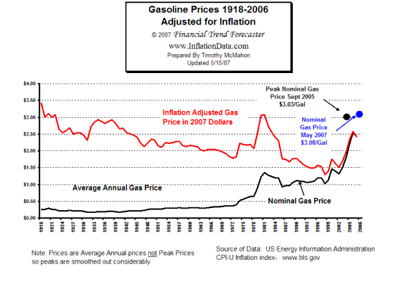
You’ve heard this point before, but despite the price of gas being at record levels, adjusted for inflation, it’s still not the most expensive we’ve ever paid for dead-dino juice in the U.S. The Auto Prophet, one of the original auto-related bloggers that’s still keepin’ it real, found this informative chart (see larger version here) from InflationData.com that illustrates this fact in a straightforward way. The black line is the actual average price of gasoline in the U.S. since 1918, while the red line represents the price of gas since 1918 adjusted for inflation.
The most we’ve paid for gas was when we first started buying a lot of it back in 1918 when the chart begins. That year Americans paid an average of around a quarter per gallon, or just under $3.50/gallon in 2007 dollars. Last week’s record average price of $3.28/gallon still falls below those early levels.
The chart is particularly interesting because it shows a general downward trend in the cost of gas when it’s adjusted for inflation. There are spikes in the red line from the oil embargo in the ’70s and the recent increases since the war in Iraq and Hurricane Katrina hit, but if you watch the red line we should expect the price to go back down. Unfortunately, the actual price of gas will probably continue to rise as it has since 1918, as well. Just as long as it doesn’t catch up to the inflation curve, the sting won’t hurt so much.
[Source: The Auto Prophet]
From Autoblog